
the oats project
packaging design
2021-2022
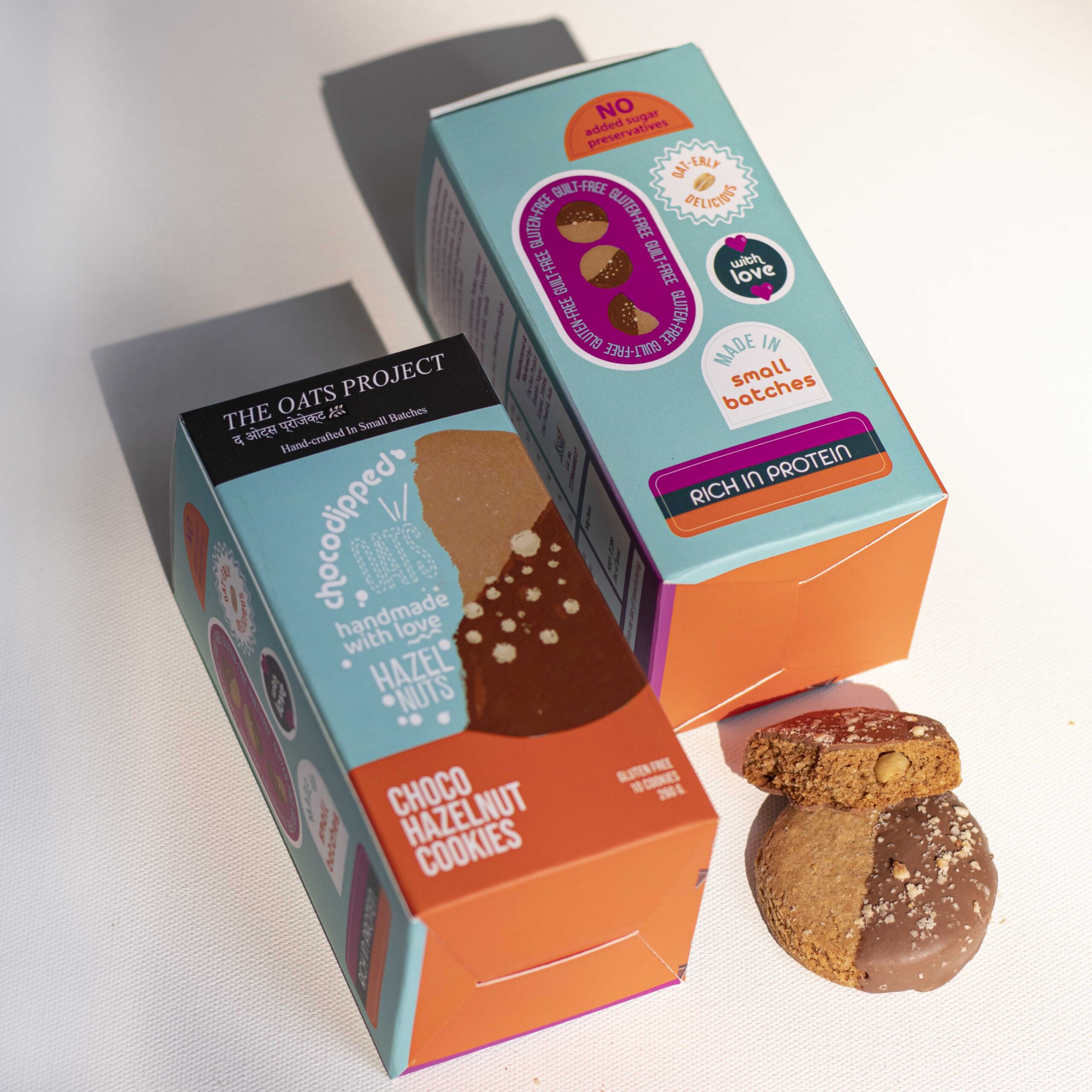
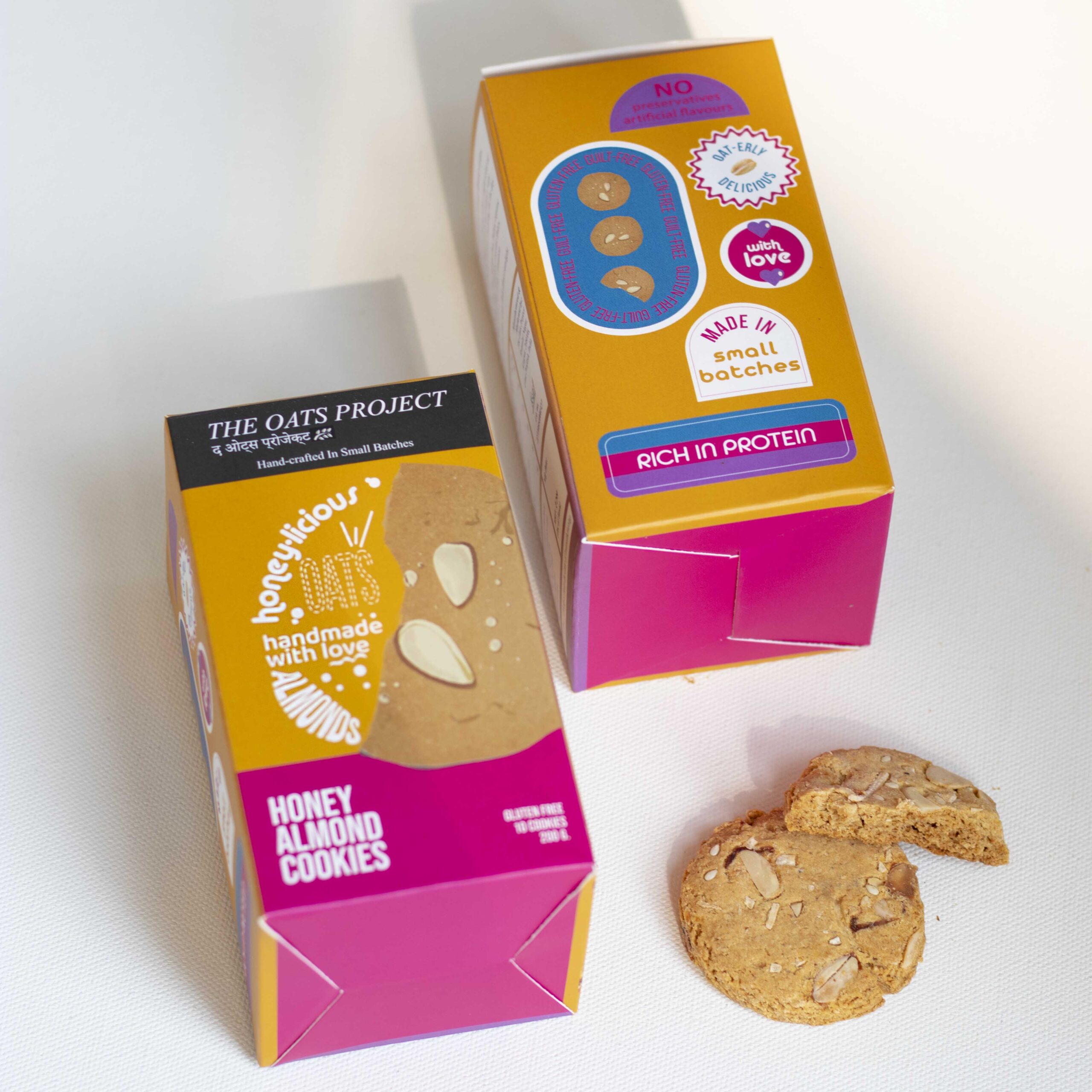
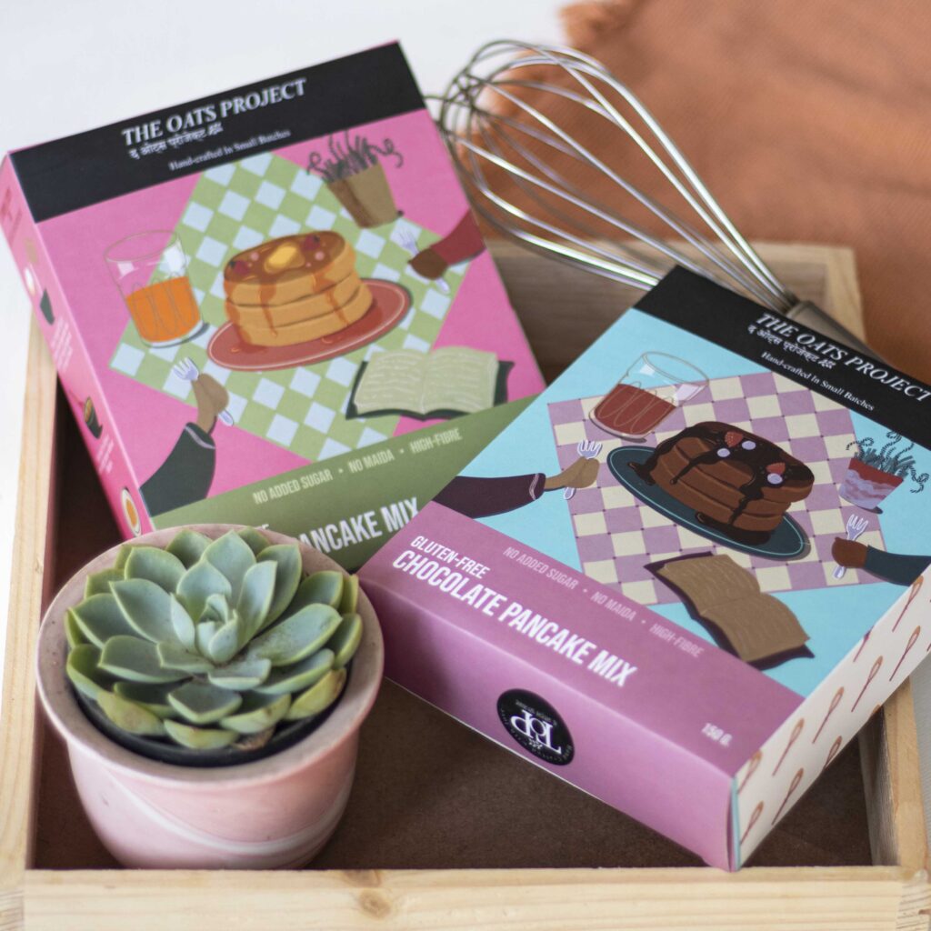
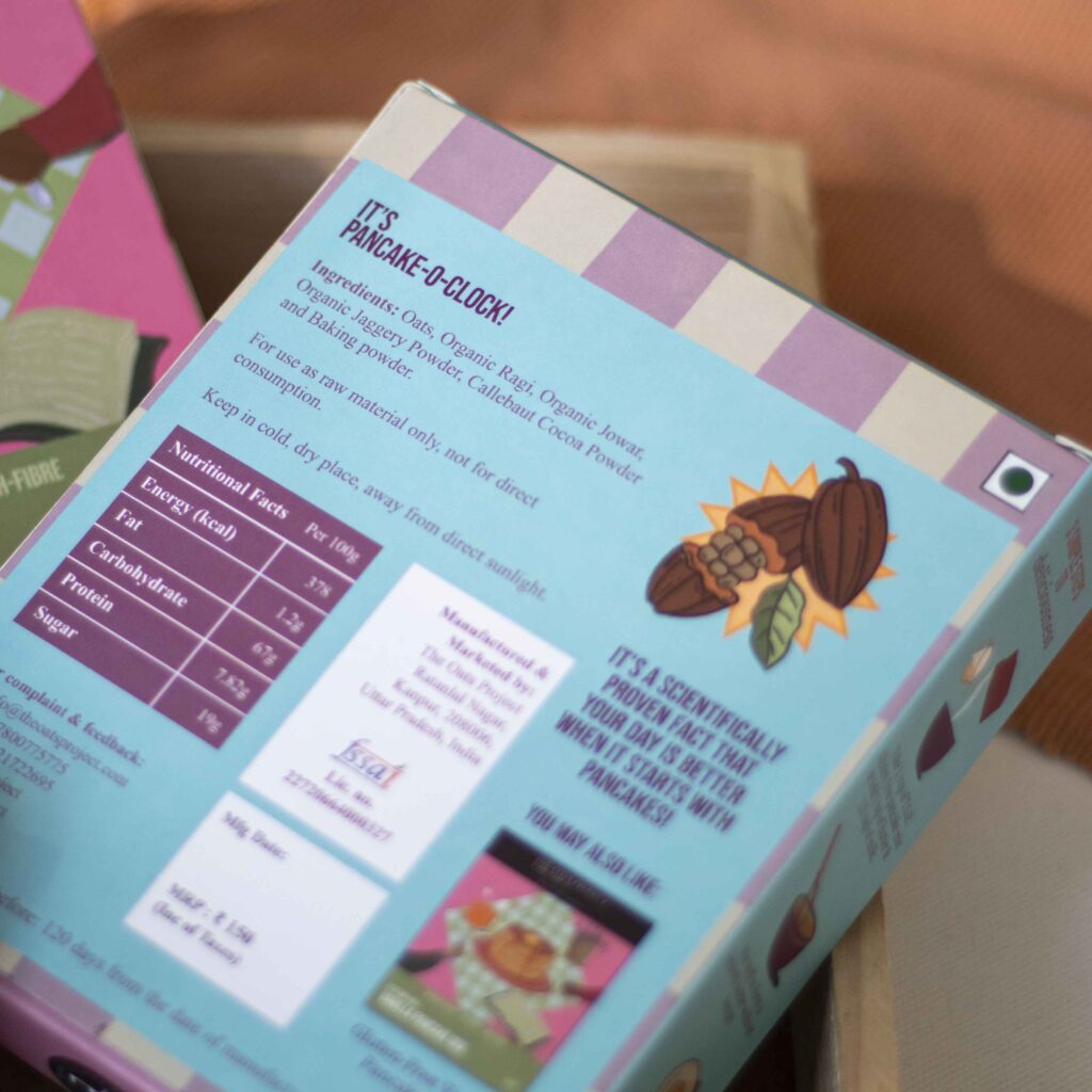
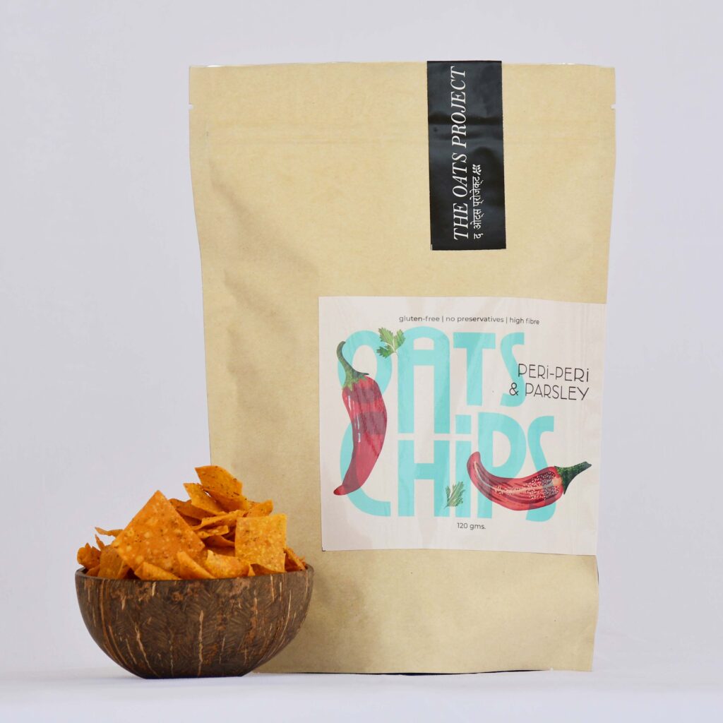
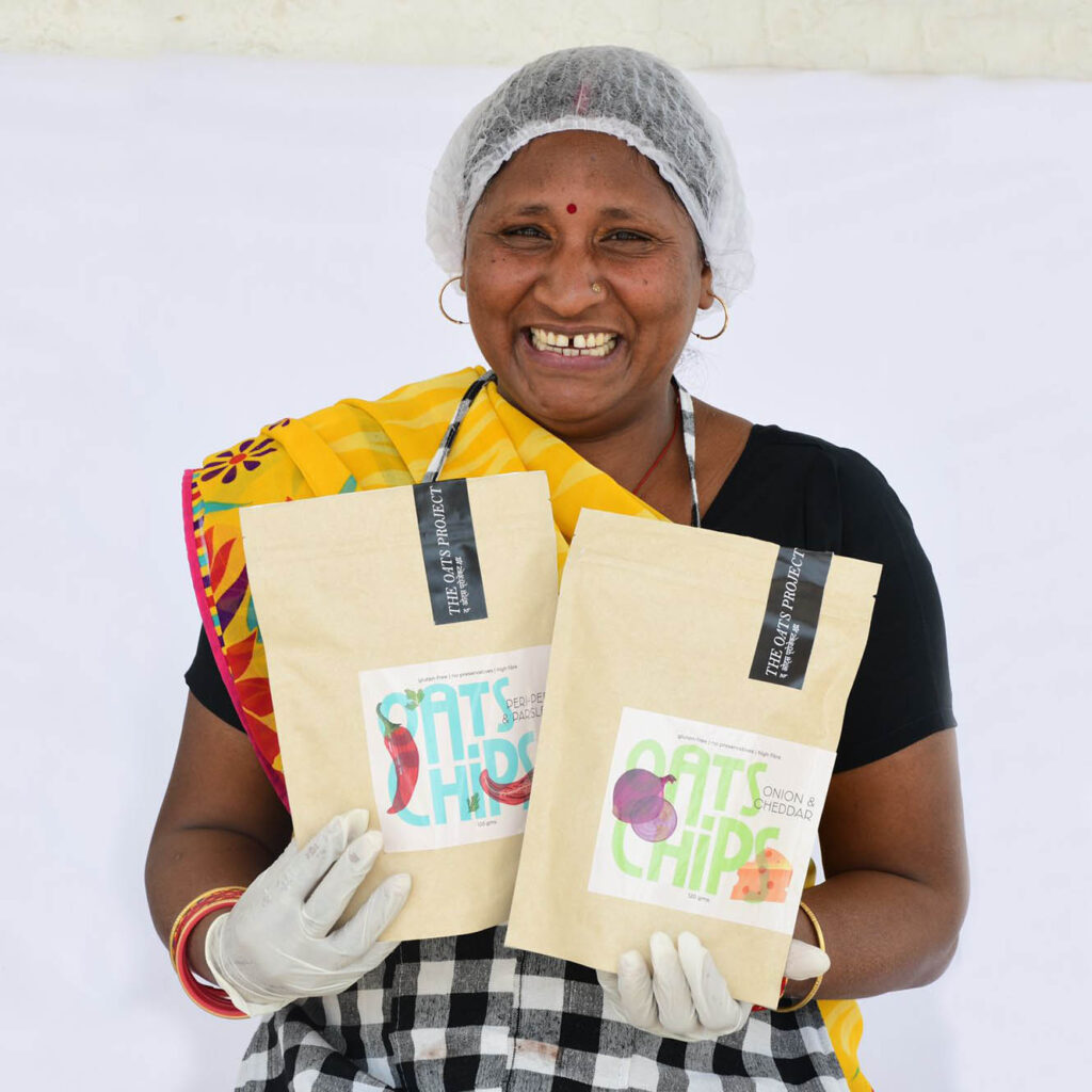
The Oats Project is brand aiming to make snacking healthy and delicious. Packaging being one of the major touchpoints, I highlighted the main features that made their products unique i.e. the carefully chosen and curated ingredients. Each packaging reflects the health focused approach of the brand yet still wholesome and craveable with tasty flavours. The use of bright colours, illustrations and play with typography helps the brand stand out from other healthy snacking brands and makes the product look more appealing.
I love this branding! Arushi created magic for us. She had clear communication and worked efficiently on making our brand’s vision come to life!
- Name
DESIGNATION BRAND

thank you bookmark
collateral design

May 2022
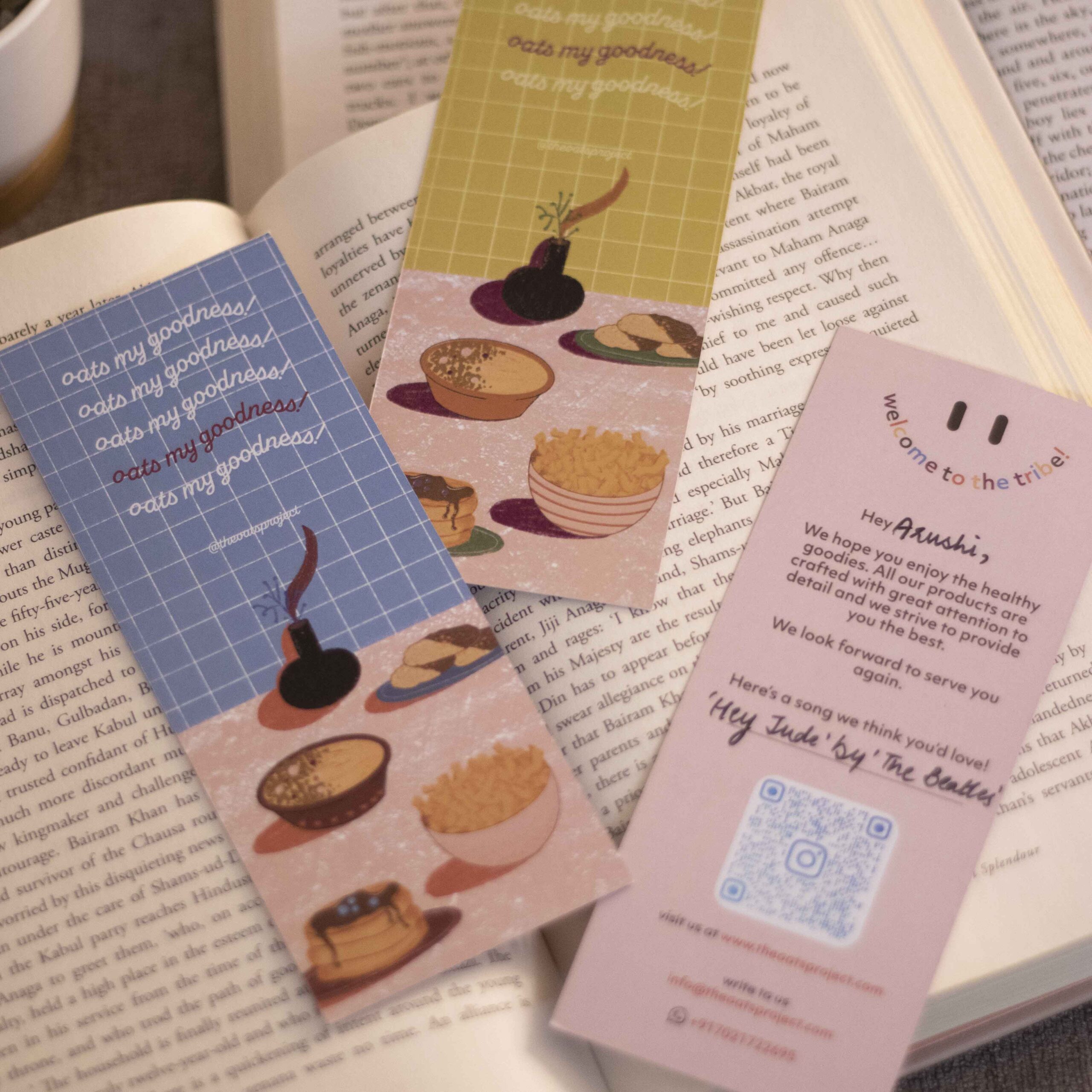
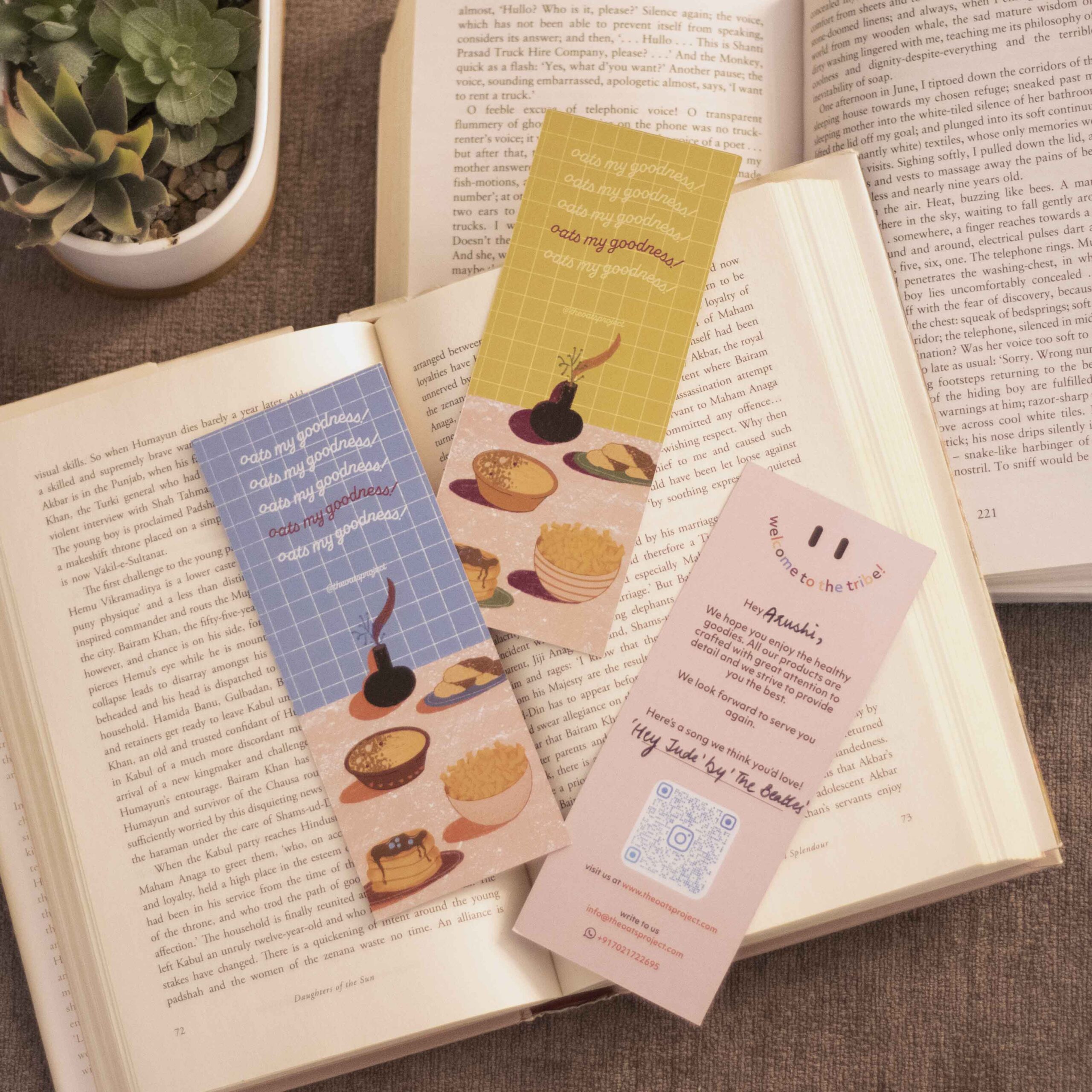
A follower of sustainable practices, The Oats Project wanted to create a thankyou card that didn’t end up in the dump. Hence, we created a Thank-you bookmark that showcased the product range of the brand as well as gave the founder a chance to give a personalised song suggestion to each customer.
I love this branding! Arushi created magic for us. She had clear communication and worked efficiently on making our brand’s vision come to life!
- Name
DESIGNATION BRAND

