arrange it all
branding design
September 2022
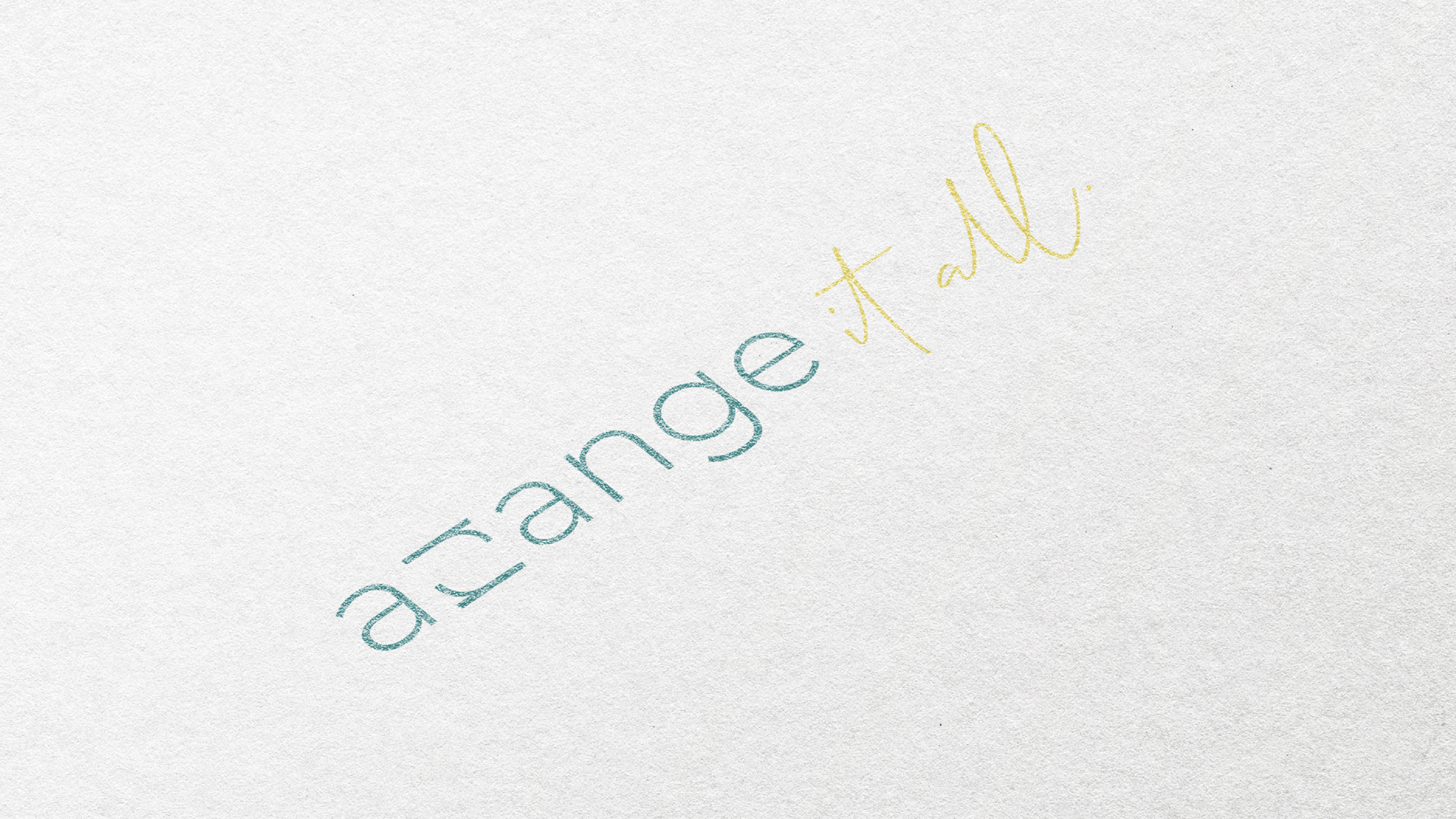
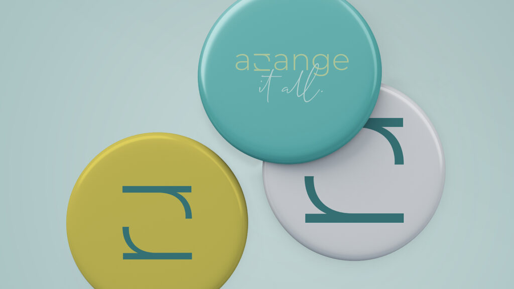
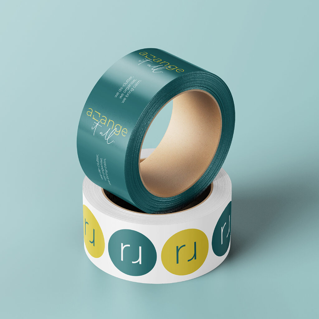
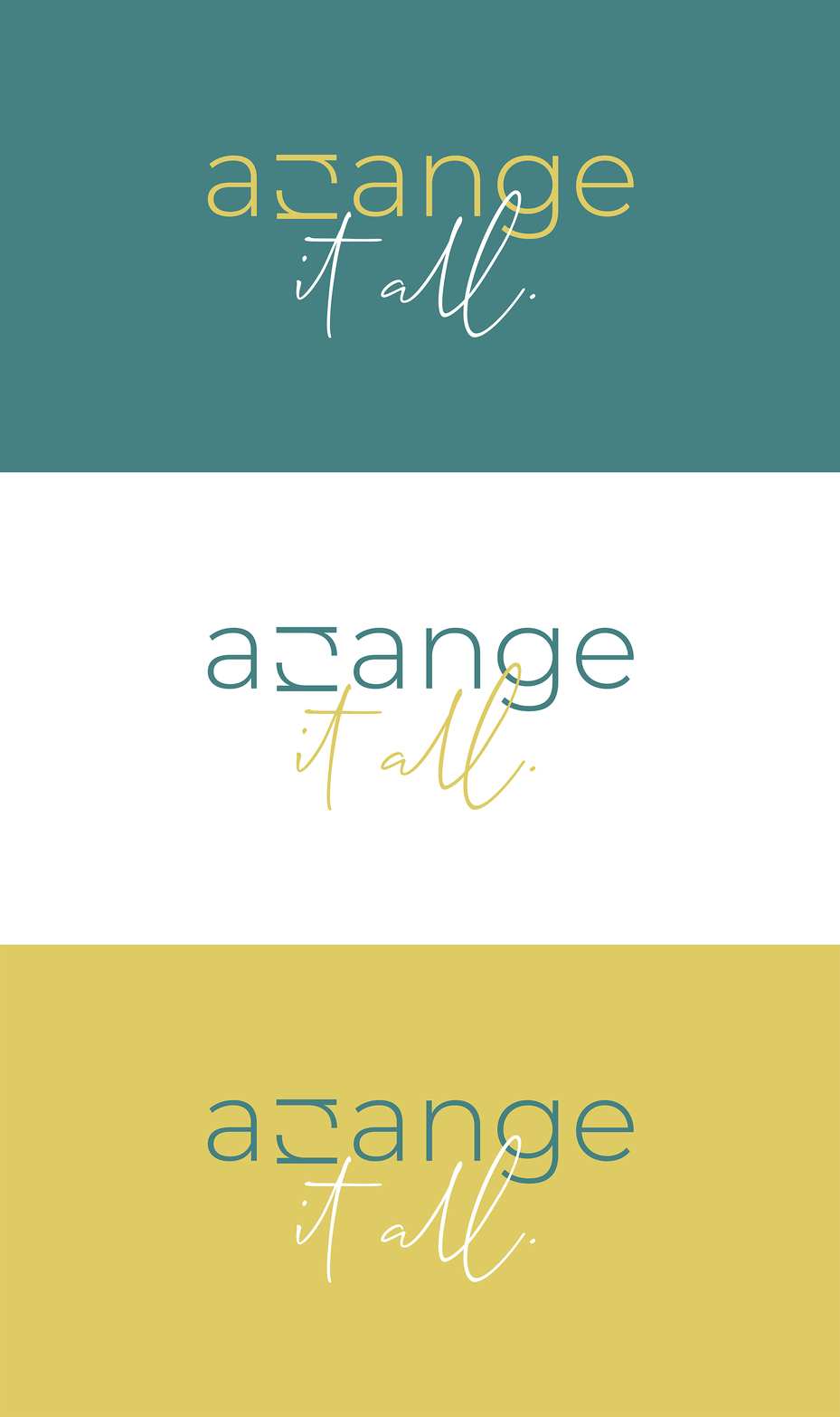
A brand design for a professional organiser and de-cluttering firm. Although their expertise lies in creating functional, clutter-free organising systems for their clients, Arrange It All’s USP is their friendly approach to all projects. Hence, the design language for the brand uses minimal design with a touch of fun using a script font.
The logomark represents the clutter-free, no nonsense organising solutions while the colour palette represents the joy the business hopes to bring to their clients. The brand looks fun yet professional, representing the core values of the business.

